
Inkwell Wine’s Rorschach-Inspired Wine Bottles: What do YOU see?
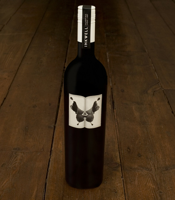
Image via TheCoolList
Boarding Pass Shiraz: Just. Plain. Clever. I love the instructional portion! As if we didn't know...cheeky.
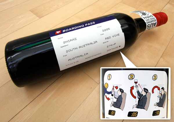
Image via TheCoolList
Shefa Profusion Wine
"Shefa" translates to "Profusion" in Hebrew and the designer has really played up the Middle Eastern feel in a fantastic modern way.

Image via TheCoolList
Churchill's Wines: I love the aerial images of the vineyards. It's a great mixture of a very graphic design with a strong personal connection to the land.

Image via Designer Daily
Four Sisters: I've been a big fan of this winery's label design for a long time. The curvature of the silhouettes is so elegant and well executed.

Image via wine.com
Monte Oton: I love the playful geometry and typography of this label.

Image via gopherwine.com
Nabuko: Not only are the colors great but the rough abstracted drawing of the grapes is what really gets me. The clean type is always a plus.

Image via prime.premiergroup
Orin Swift "Papillon": Match made in heaven...for me at least. B/W photography, hands, high contrast??? Sign me up! This one literally jumped off the shelf at me.


Images via Salut! Wine Company Outlet and KL Wines
Educated Guess: Clever. It seems like the art of winemaking could be just about as complicated as their
label design.

Image via Popsop.com
Root:1: Simple, nice integration of type and graphic. The root design really helps to visually elongate the
bottle itself.

Image via Global Package Gallery