

Showing posts with label Graphic Design. Show all posts
Showing posts with label Graphic Design. Show all posts
2/02/2012
Happy feet
I'm really enjoying these posters designed by Amy Rodchester for the Newcastle Festival of Dance. Love the three dimensional quality and vintage vibe!
8/08/2011
Letterpress class!
I'm pretty excited to take my first letterpress class today! Just wanted to gather up a little inspiration and a few cool videos. I'll report back after the class tonight. I can't wait to see what we'll get to make!

Images 1, 2, 3, 4, 5, 6
No clue what any of this is about? Here's a great instructional video from Naomie Ross:
...and another fun one from Egg Press in Portland, OR:
Images 1, 2, 3, 4, 5, 6
No clue what any of this is about? Here's a great instructional video from Naomie Ross:
Letterpress from Naomie Ross on Vimeo.
...and another fun one from Egg Press in Portland, OR:
Egg Press Letterpress Video from Pressing Letters on Vimeo.
7/14/2011
Signed, Sealed, Delivered
How great are these envelopes?! I'm loving the illustrated return addresses for the different business. Stay tuned for some fun posts from the Dwell on Design convention and our Long Beach adventure (complete with very cool jellyfish pictures).

Images
Images
6/28/2011
It's enough...
These are definitely some words by which to live. I need a lot of reminding in this area lately. The fact that nothing in the universe is perfect is relieving and a bit sad at the same time. I keep telling myself, "Do what you can with what you have." Also, don't forget to breathe (or eat your greens).

Poster design by Lisa Barbero
Poster design by Lisa Barbero
6/27/2011
Erin Jang's Stop Motion
I'm really loving these little stop motions gems from Erin Jang. She created these for Martha Stewart Living. The photography is by Johnny Miller. You'll definitely want to have a look at her other design work for Martha Stewart Living and Esquire. She's also created some great letterpress wedding invitation suites for Bella Figura (one of my favorites).
6/21/2011
Double Merrick
I've been loving these giclee prints from Double Merrick for awhile now. La Lune is definitely my favorite. The simplicity is beautiful.

Images
Images
9/10/2010
Wow...weave.
Right, so, I had no intention of posting anything else today but then I stumbled upon this! This made the part of my brain devoted to typography light up like Vegas. It gets me all gooey inside when designers go to such great lengths to create typefaces. Glorious. You (and I ) can thank the French design duo Zim and Zou for this awesomeness.


Found at paper tastebuds. Images via Behance Network


Found at paper tastebuds. Images via Behance Network
8/08/2010
Renegade Craft Fair-Los Angeles!
Ok, folks, I think we all know I've been super neglectful lately. I have been in a massive no-blogging-rut the past week and a half. Between my new jobs, running, personal projects, and general day-to-day business, my poor blog has been ending up at the bottom of the list. I'd get home feeling exhausted, make dinner, tidy up a bit, shower, and then think about posting and it just never happened. Sorry!!!!! I'm determined to get back on track and thanks to a lovely reader's request for me to get my bum in gear (haha, my words not her's) I'm bringing you a brand spankin' new post about the Renegade Craft Fair from two weekends ago. The fair was nestled between the Chinatown Metro station and Dodger Stadium in the lovely LA Historic Park. It was seriously toasty and seriously CROWDED. I can't really complain about the crowds as I'm glad people are so supportive of handmade goods and the artisans who craft them so lovingly. Although the big people-pet-stroller clusters made it hard to photograph the way I wanted to and I had Luke with me (and being the thoughtful partner that I am, I didn't want to make him spend 6 hours in July heat looking at letterpress cards and succulent terrariums). Therefore, to preface my images, I don't have the names/links of all of the vendors I photographed. So sorry! It was just too crazy to keep track. That being said, let's look at my highlights from the FAIR!!!

Here we go!


It looks a bit more like the owl is eating me and thumbing for a ride...no shame.

{paper & type} Display... Their designs are so sweet and basic.

Scarlett Garnet jewelry designs...lovely! They also win my Most Unique Business Card Award because their logo rocks my socks. I love the cool art nouveau design!!


Miniature Rhino had this cool message in a bottle display and their awesome embroidery (see their Etsy link).

Succulent Terrariums!! It took everything I had not to buy one of these. But I knew I probably kill it in a month.

Cool way to display these vials of seeds!

Another great display idea! This would be so easy to recreate at home too. Just find some interesting frames and a bit of mesh or a few pieces of pretty chain, add a few staples or nails and hang them in a cluster by your dresser or in the bathroom. Bonus point: arrange your earring collection by color or style *wink*.

Crafty and inexpensive and recycled display! I thought this was such a great way to house these earrings!

Yay! I can't wait to have my own Etsy shop.

Hah.

Poster Displays. I saw a few that were new to me. I feel like I've seen every poster design out there lately.

I loved this paper crane mobile. Another cool idea to make at home on the cheap!

Ok, now on to one of my favorite parts of the craft fair! Threadless Tees had an Airstream trailer you could go in and post your own shirt design on their templates. It was a really fun idea and there were some pretty funny ones in there.


T-Shirt designs EVERYWHERE!

My favorites:


This one summed up what I was thinking all day.

On a more serious design note, I really liked this one a lot.


So, there you have it! My experience of the Renegade Craft Fair! Oh, I was VERY good and bought one SMALL print from Honeylux (I was a bad photographer and totally blew out my image of her table)! This is the print I bought! If you're interested in attending a fair, the next stop is Chicago on September 11th and 12th. They are also having holiday events in Chicago and San Francisco. Check out their site for more information. Over and out! Thanks, special reader for throwing some accountability my way!

Here we go!
It looks a bit more like the owl is eating me and thumbing for a ride...no shame.
{paper & type} Display... Their designs are so sweet and basic.
Scarlett Garnet jewelry designs...lovely! They also win my Most Unique Business Card Award because their logo rocks my socks. I love the cool art nouveau design!!
Miniature Rhino had this cool message in a bottle display and their awesome embroidery (see their Etsy link).
Succulent Terrariums!! It took everything I had not to buy one of these. But I knew I probably kill it in a month.
Cool way to display these vials of seeds!
Another great display idea! This would be so easy to recreate at home too. Just find some interesting frames and a bit of mesh or a few pieces of pretty chain, add a few staples or nails and hang them in a cluster by your dresser or in the bathroom. Bonus point: arrange your earring collection by color or style *wink*.
Crafty and inexpensive and recycled display! I thought this was such a great way to house these earrings!
Yay! I can't wait to have my own Etsy shop.
Hah.
Poster Displays. I saw a few that were new to me. I feel like I've seen every poster design out there lately.
I loved this paper crane mobile. Another cool idea to make at home on the cheap!
Ok, now on to one of my favorite parts of the craft fair! Threadless Tees had an Airstream trailer you could go in and post your own shirt design on their templates. It was a really fun idea and there were some pretty funny ones in there.
T-Shirt designs EVERYWHERE!
My favorites:
This one summed up what I was thinking all day.
On a more serious design note, I really liked this one a lot.
So, there you have it! My experience of the Renegade Craft Fair! Oh, I was VERY good and bought one SMALL print from Honeylux (I was a bad photographer and totally blew out my image of her table)! This is the print I bought! If you're interested in attending a fair, the next stop is Chicago on September 11th and 12th. They are also having holiday events in Chicago and San Francisco. Check out their site for more information. Over and out! Thanks, special reader for throwing some accountability my way!
6/11/2010
Mr. Boddington, I presume?
I get excited (like a beagle getting a piece of filet mignon excited) by GOOD stationery design. Whether it be business, wedding, greeting, or holiday related, if it's unique and well executed, I'm all over it! I have plenty of favorites out there but one of my all time true loves will always be Mr. Boddington's Studio. If the name alone doesn't evoke images of artfully created paper goods, this little excerpt from the site might do it for you, "Mr. Boddington owns a vintage Capri fishing yacht and drinks Bombay gin and tonics while eating bread with orange marmalade. And although never confirmed, it has been said that Mr. Boddington exhibits no tolerance for haggard looking correspondence." I have no tolerance for it either which is why I'm about to shower you with beautifully designed work!


This is just the tip of the iceberg! For more design goodness, check out Mr. Boddington's Studio online!
This is just the tip of the iceberg! For more design goodness, check out Mr. Boddington's Studio online!
4/29/2010
Wine n' Dine
I'd have to say that the wine aisle in the grocery may just be my favorite. Not because I'm a raging wine guzzler but because I absolutely LOVE looking at the creative array of labels. Sometimes when I really can't decide between two similar wines, I'll typically go with the more interesting or design savvy label. Seriously, people, it pays to brand WELL. That being said, here are some of my favorite creative labels.
Inkwell Wine’s Rorschach-Inspired Wine Bottles: What do YOU see?

Image via TheCoolList
Boarding Pass Shiraz: Just. Plain. Clever. I love the instructional portion! As if we didn't know...cheeky.

Image via TheCoolList
Shefa Profusion Wine
"Shefa" translates to "Profusion" in Hebrew and the designer has really played up the Middle Eastern feel in a fantastic modern way.

Image via TheCoolList
Churchill's Wines: I love the aerial images of the vineyards. It's a great mixture of a very graphic design with a strong personal connection to the land.

Image via Designer Daily
Four Sisters: I've been a big fan of this winery's label design for a long time. The curvature of the silhouettes is so elegant and well executed.

Image via wine.com
Monte Oton: I love the playful geometry and typography of this label.

Image via gopherwine.com
Nabuko: Not only are the colors great but the rough abstracted drawing of the grapes is what really gets me. The clean type is always a plus.

Image via prime.premiergroup
Orin Swift "Papillon": Match made in heaven...for me at least. B/W photography, hands, high contrast??? Sign me up! This one literally jumped off the shelf at me.


Images via Salut! Wine Company Outlet and KL Wines
Educated Guess: Clever. It seems like the art of winemaking could be just about as complicated as their
label design.

Image via Popsop.com
Root:1: Simple, nice integration of type and graphic. The root design really helps to visually elongate the
bottle itself.

Image via Global Package Gallery
Inkwell Wine’s Rorschach-Inspired Wine Bottles: What do YOU see?
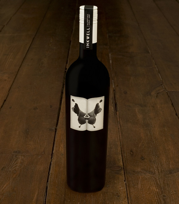
Image via TheCoolList
Boarding Pass Shiraz: Just. Plain. Clever. I love the instructional portion! As if we didn't know...cheeky.
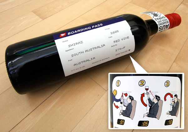
Image via TheCoolList
Shefa Profusion Wine
"Shefa" translates to "Profusion" in Hebrew and the designer has really played up the Middle Eastern feel in a fantastic modern way.

Image via TheCoolList
Churchill's Wines: I love the aerial images of the vineyards. It's a great mixture of a very graphic design with a strong personal connection to the land.

Image via Designer Daily
Four Sisters: I've been a big fan of this winery's label design for a long time. The curvature of the silhouettes is so elegant and well executed.

Image via wine.com
Monte Oton: I love the playful geometry and typography of this label.

Image via gopherwine.com
Nabuko: Not only are the colors great but the rough abstracted drawing of the grapes is what really gets me. The clean type is always a plus.

Image via prime.premiergroup
Orin Swift "Papillon": Match made in heaven...for me at least. B/W photography, hands, high contrast??? Sign me up! This one literally jumped off the shelf at me.


Images via Salut! Wine Company Outlet and KL Wines
Educated Guess: Clever. It seems like the art of winemaking could be just about as complicated as their
label design.

Image via Popsop.com
Root:1: Simple, nice integration of type and graphic. The root design really helps to visually elongate the
bottle itself.

Image via Global Package Gallery
Subscribe to:
Posts (Atom)